What are the Best Colors for Your Brand
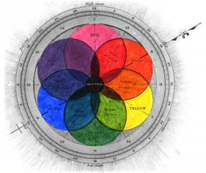
The choice of colors for the brand’s advertising has to be not just a feature of the beautiful design but also the part of the well-thought strategy of long-term promotion. Psychologists have long noticed that the colors and color combinations can cause different emotions depending on the proportions and some other factors (for example, red color in a food restaurant helps to consumpt food faster and so frees seats for new visitors).
Colors create mood and character of the brand, as well as distinguish a true brand from the trademark. There are several concepts that can be applied when choosing and using a color – each one of them has its own distinctive features:
- Monochrome. Monochrome is often a feature of upper-middle and premium brands. It’s much harder to create a high-quality monochrome design than a vibrantly coloured one.
- Multiple colours in a palette. Calm and pastel colours are as well the attributes of a premium level. For example, visual communications of a chocolate related brand, may be based on shades of brown and beige, which are associated with the product, and advantageously combined with gold lettering: a status design element.
Multi-colored and bright shades are often common in the design of childish and adolescent brands. Their function is to entertain and delight. Their main principles are the dynamics and the game. Bright colors are also effective “catchers” since they really catch the buyer’s attention. This is especially important if the product is placed on the supermarket shelf among with many other competitive goods. Brightness and combination of many colors make the whole composition more dynamical.
- Highly contrast palette. They are often about the contrast between a background and an image. Depending on the color combinations, such solution is effective for brands designed for both young people and more demanding urban audience.
- Domination of natural colors. According to researches, natural colors (shades of green, blue, pale peach, and soft brown) would be in trends in the second half of 2016. The same colors are highly recommended for the packaging of food products. Designers are now trying to avoid the acid, unnatural colors. When they create product images, they usually prefer using photorealistic illustrations and natural landscapes/greens as a background.
As marketers have found out, color preferences are based on the age group of consumers, the level of their income, and education. The higher the educational level, the greater the commitment to the “delicate” colors. The same trend is relevant to the high-income segments.
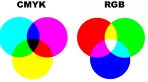
The choice of color is also affected by the regional and national identity. For example, the red color is the favorite one among Italians and Mexicans. Thus, you can increase sales significantly if you take the nature of color into account while creating promotional materials, packaging and logos. To see the examples of good color usage in logos, check out websites like www.designcontest.com/logo-design/.
Let’s see how the 10 main colors can affect a person:
- Red. It stimulates the action. In other words, the red creates a desire to buy a product that is advertised. This color also can quickly attract attention. No wonder that the signs with the words “Caution” are painted red. But it is worth remembering that moderation is a virtue: if you use too much of this color, do not expect high conversion. Such an excessive amount of red color makes the reader aggressive and hostile towards your advertising. As a result, the client will dislike your brand as a whole.
- Orange. Vitality and a surge of positive energy are the associations the orange color brings. Use it to advertise children’s products, medicines, and everything related to the educational field. This color also brings inner harmony.
- Yellow. It’s a color of the sociability, associated with openness and willingness to communicate. The yellow suits travel companies the best.
- Green. The most soothing tone that helps to relax. It’s ideal for promoting medicines or dental clinic services.
- Pink. This delicate color is well suited for advertising of a perfume brands. Pink is many women’s favorite color, so do not forget to use it in the case if your target audience consists of women mostly.
- Light blue (cyan). It’s a color of peace and friendliness.
- Blue. A saturated color that draws attention to the important features of your service. Unlike the red, the blue can’t provoke negative emotions.
- Purple. Use it in case you want to focus the attention of visitors on the problem. Also, the purple is great to emphasize your creativity.
- Black. Don’t use it in advertising (except as font color), since black can cause a feeling of depression and isolation.
- White. It’s a color of full openness. It can’t bring bad and unwanted emotions – it rather creates a neutral impression.

Currently color theory is becoming more relevant in the online marketing field as it helps to influence the growth of bounce rate and other statistics indicators. When visitors decide whether to trust your brand or not, every detail is important. And the use of color theory can have a decisive impact on the visitors’ minds, forcing them to make the target actions.
When you choose the colors for your brand, remember the color theory: it’ll help you to improve the aesthetics and readability of the web pages, as well as to create the necessary psychological impact. Instead of using colors that will just look good, you can create a design that will give you real benefits. Based on the theory of colors, you can achieve maximum user engagement and minimize the risks of losing the potential customers.
Brian Jens always thinks about his readers and that is why all of his posts are interesting and helpful. You can find a lot of useful tips reading his blog. If you want to know more about Brian’s career and or want to be one of his clients, welcome to www.designcontest.com
